Flicket: A Contemporary Display Serif for Digital Branding
Two weeks ago, I was refining the hero section of a boutique online store’s new product landing page—clean layout, soft photography, intentional whitespace—and realized the default sans serif headline felt too neutral. It wasn’t *wrong*, but it wasn’t saying enough about the brand’s voice: thoughtful, quietly confident, with a hint of creative playfulness. That’s when I pulled up Flicket.
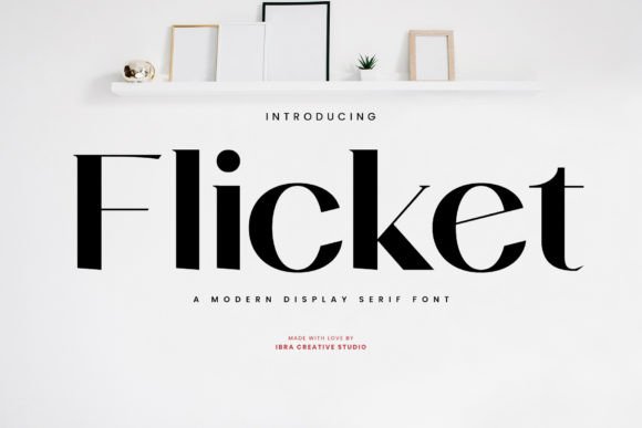
Flicket is a contemporary display serif font from Script Amp—a category that sits beautifully between editorial elegance and digital friendliness. It’s not a traditional serif like Times New Roman, nor is it a flowing script. Instead, it balances clean, open letterforms with subtle flourishes: a gentle curve on the ‘g’, a refined terminal on the ‘a’, just enough personality to feel human—but never distracting. On screen, it breathes. It doesn’t shout. It invites.
I dropped Flicket into the hero headline first: “Handcrafted Ceramics, Thoughtfully Made.” At 48px on desktop, it held weight without heaviness. The contrast between its delicate serifs and the minimalist product imagery created visual rhythm—not tension. More importantly, it supported the brand’s tone without needing explanation. That’s rare in web typography.
For readability across devices, I tested Flicket at multiple sizes and contexts. On mobile, I kept it above 32px for headlines and avoided using it below 24px—even then, only for short, high-impact phrases like “New Collection” or “Join the Studio.” It’s not built for body copy, and trying to force it there would undermine both legibility and intent. Flicket shines where attention matters most: hero titles, section headers, CTA banners, shop category labels, and course page subheads. Think “Your Next Creative Breakthrough” over a soft gradient, or “Work With Me” centered above a coach’s intro video.
What surprised me was how well it performed over image overlays. Many display fonts blur or lose definition when placed on textured or busy backgrounds—but Flicket’s generous x-height and open counters kept letters distinct even at 70% opacity on a warm-toned ceramic studio photo. I used it lightly: one line, centered, with tight letter-spacing (–20 tracking) to reinforce cohesion. No stroke, no shadow—just the font, doing its job.
Pairing Flicket was intuitive. I paired it with a relaxed, highly readable sans serif—something like Inter or Manrope—for all body text, navigation, and form labels. That contrast works because Flicket isn’t competing; it’s elevating. It gives hierarchy *without* hierarchy gymnastics. You don’t need bold weights or caps lock to signal importance—you simply use Flicket where meaning lives, and let the supporting type do the work of clarity.
In practice, that meant:
- Hero section: Flicket for the main headline only; sans serif for the supporting sentence and button
- Product grid banners: Small Flicket labels (“Limited Edition”, “Studio Exclusive”)—never more than two words
- Course sales page: Section dividers (“What You’ll Learn”, “Your Instructor”) set in Flicket at 36px, then body in clean sans
- Blog header graphics: Used sparingly for featured post titles in social previews—not inline in articles
One thing I double-checked before deploying: webfont delivery. Flicket includes WOFF2 files, variable weight support (though I stuck with Regular and Medium for consistency), and basic Latin multilingual coverage—enough for English, Spanish, French, and German markets. No extended Cyrillic or Arabic glyphs, so I noted that for future international expansion. Licensing is straightforward: commercial use included, no per-page fees, and full access to stylistic alternates (like the swash ‘Q’ or connected ‘st’ ligature) if you want to add quiet moments of refinement.
I also tested it in dark mode. On a charcoal background with light text, Flicket retained warmth—no coldness, no pixelation. Its rounded terminals softened the contrast just enough to feel approachable, not clinical. That’s key for brands that want sophistication *and* accessibility—not one at the expense of the other.
Where Flicket isn’t the answer? Long paragraphs. Navigation menus with more than five items. Button labels under 140px wide. And logos—unless it’s for a wordmark-only identity where the brand already leans heavily into typographic storytelling. It’s a display font first, and that intentionality is part of its strength.
What stood out most wasn’t just how Flicket looked—but how it changed the *pace* of the page. Users lingered longer on headlines. Scroll depth increased slightly—not because of gimmicks, but because the typography signaled something worth pausing for. That’s not magic. It’s thoughtful type choice meeting real user behavior.
If you’re selecting fonts for a portfolio site, coaching homepage, digital brand kit, or campaign landing page, ask yourself: does this typeface reflect what the brand *feels like*—not just what it says? Flicket answers that question with quiet confidence. It doesn’t try to be everything. It’s a premium font that knows exactly where it belongs—and helps your digital experience feel more intentional, more human, and more unmistakably yours.